
If you manage a business or a community organization, a web site of some type is a must. It’s the primary way people find and learn about you. Given how important a good website is, it’s amazing how little thought many website owners put into the design and content of their site. Web design is a complex skill. If you don’t have the resources to hire a professional, you need to think critically about what you publish and how you present it.
A good place to start is by identifying what drives you crazy on websites you visit and making sure your site isn’t guilty of the same crimes. To get you going, here are some Web sins that I find particularly annoying.
The website is physically hard to read
When people find a website difficult to read, it doesn’t matter how much they need the service or product offered, they’ll go somewhere else that is less work. Factors that affect readability include
- Font size
If the font is too small, it’s hard to see. If it’s too large, it’s tiring to read. It’s a good practice to test your font choices on a variety of devices with several test users to ensure everyone can read it easily.
- Fancy fonts
Fancy fonts are great attention grabbers on printed posters and invitations but they don’t belong on the Web. They’re difficult to read and are unlikely to be displayed the same across all platforms. Instead, choose a simple font family. Use the serif font for headings and the sans-serif font for body text.
- Centred paragraphs
When reading centred text, you have to search for the beginning of each line. It’s hard work and becomes annoying pretty quickly. Left justify your text unless, of course, you’re writing in a language that reads right to left.
- Poor contrast between the background and the text
Have you ever tried to read yellow text on an orange background or blue text on a black background? It’s not easy, is it?
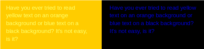
Text on a background of a similar colour or shade is hard to read.
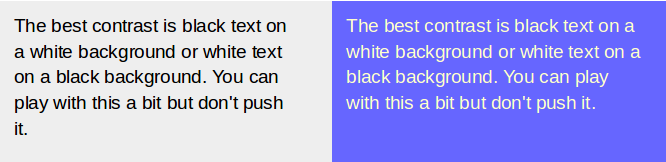
The best contrast is black text on a white background or white text on a black background. You can play with this a bit but don’t push it.
Text on a high contrast background is easier to read.
The website isn’t responsive
A responsive website automatically formats itself to match the device it’s being viewed on so that it’s always readable. For a live example, compare this blog on a phone, a tablet, and a computer.
People are using their phones more and their computers less, so a responsive site isn’t just nice to have. It’s a requirement to keep your audience happy. Also, Google gives priority to sites that are responsive, so it’s worth the effort to comply.
Building a responsive site from scratch is a mountain of work and requires some serious skill. Fortunately, there’s an easy way to do it. Use a blog like WordPress or Blogger for your website. Making your site responsive is just a matter of selecting the option.
If you’re going to use HTML software, look for a package that supports responsive design and includes responsive themes. Pick an appropriate theme and modify it as you find necessary.
The website doesn’t meet my needs
I’ve saved the most important for last. If a website doesn’t meet the needs of the intended audience, it’s a failure. There are a lot of ways to go wrong so you have to think carefully about your audience’s needs.
Answer questions like
- Who is coming to the site?
- How much do the already know about the product or service?
- What information are they looking for?
- What tasks do they want to complete?
This list is just a start. Think of other questions that apply to your situation and then make sure that your website can support your audience.
Although I can’t tell you about your audience, I can tell you about myself and situations where websites failed to meet my needs.
A few years ago, my husband and I wanted to try a restaurant that had opened a new location. I went to their website to see if I needed to make a reservation for lunch. I looked, and looked, and looked but I couldn’t find any information about reservations or even a phone number. I assumed I didn’t need a reservation. I was wrong. The restaurant has since gone out of business.
What information does a restaurant customer need? Location, hours, phone number, and whether or not reservations are required. All of that information should be on the main page of the website.
Recently, my husband was shopping online for recessed lighting. He found a source that probably had what he was looking for but we’ll never really know. Instead of organizing products by type with meaningful names and descriptions, the company listed the products by part number—just a long list of part numbers. There wasn’t even a search function.
What information does a DIY customer need? Searchable product names and descriptions, prices, and availability.
Website usability and design covers much more than the issues I’ve mentioned here. I could write a book about it. Fortunately, I don’t have to because so many others have. The best of the lot is Ginny Redish’s Letting Go of the Words. If you’re a Technical Communicator, it should already be on your bookshelf. If you’re not a Technical Communicator, see if you can borrow a copy.
